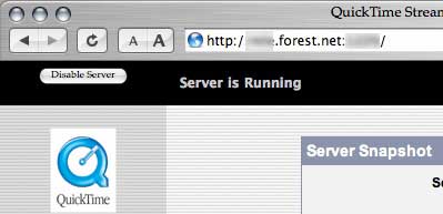
Apple’s QuickTime Streaming Server doesn’t have much of a UI, but there is a fatally stupid design flaw in what little it does have.
You run the UI in a web browser. I use Apple’s own Safari for my web browser (I actually use several different browsers, but I use Safari for administration tasks for some reason). To get fresh data, namely stats on the “server snapshot” page, you need to refresh the browser. But here, have a look at where the geniuses at Apple put the “Disable Server” button… note the proximity to refresh button in Safari!

Tonight, while a good client was “live” and I was providing stats via iChat with their production staff… I accidentally clicked a few pixels too low and shut down the server. D’oh!
In my defence, I am test-driving a new mouse (an Apple Mighty Mouse btw) and my clicking is not as precise as normal, but still. They should put that “stop server” button somewhere else, don’t you think?
That one always bugged the hell out of me. It’s amazing how many systems have something similar. Look at any of the Cisco web interfaces for proximity issues. 🙁
Real Network Administrators don’t use web interfaces for managing hardware. 😉
Yeah, but when you’re offloading tasks to other people, and they don’t understand anything about IOS (like anyone really understands IOS, but I digress), you open the web interface and start to pray.
Holy shit… there are some tasks that shouldn’t be offloaded… or more accurately some people that some tasks should not be entrusted to. Futzing with IOS while blind counts as one of those.
Plus Cisco’s HTTP implementation has had several security issues, and should be turned off as a matter of course.