This is my work.
That’s a double entedre of sorts as it is also, for the moment, my employer, but what I’m talking about here is this logotype. Back when dinosaurs in neon-colored Member’s Only jackets roamed the earth, I was a Graphic Designer. I designed this at the request of my friend, Chris Kilbourn, who started d.f back in 1994. For posterity, here is the back-story of its creation; (Kilbo can fill in any details I’ve forgotten in the comments)…
When I was a professional designer I kept sketchbooks. Usually hard-bound books of blank heavy paper. I doodled and wrote in them constantly, usually with a black felt-tip pen. )I hate ball-points, and pencil doesn’t hold up well to wear.) I’ve kept all sorts of bad habits over the years but losing this good habit of doodling I regret deeply.
Several years prior to doing this logo for d.f I had done a whole corporate identity for a housing development called “Pine Lake Glen” on the Issaquah/Sammamish plateau. Back then it was a lot like the area I live now; high ground in the Cascade Foothills, with a few horse properties and widely scattered houses. It was just beginning to be developed. Now it is a bustling surburbia with a Starbucks on every corner, and expensive SUVs plying the driveways and parking lots. In my sketchbooks at the time I doodled a lot of trees coming up with the look for PLG. I settled on a set of three, which I had created with a paintbrush. I’ve often thought about driving up to the plateau and seeing if the signage I designed is still there, some 20+ years later.
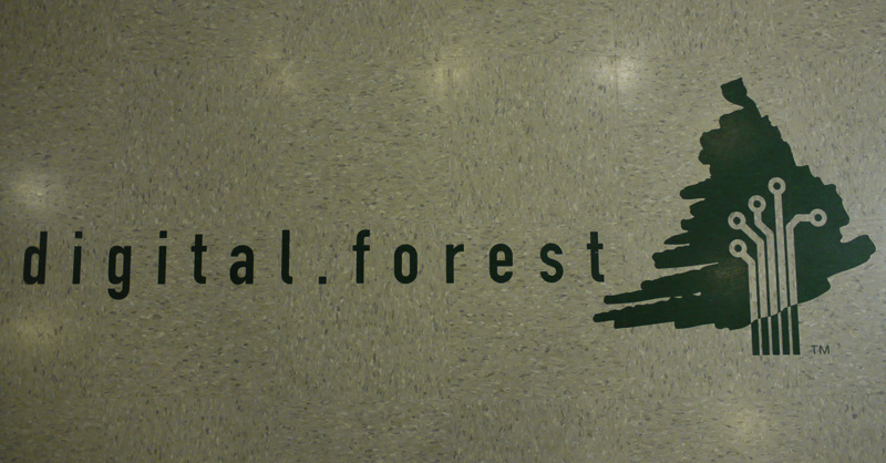
When Chris asked me to design the d.f logo I remembered all those trees I had drawn years before and dug out my sketchbook. Sure enough, at some point I had made the perfect “tree”, with a fat loose-ended marker that had a wonderfully frenetic, organic shape. It would contrast well with the circuit-board motif I planned to mate with it to capture the incongruous combination of thoughts that is digital.forest. The typeface may look familiar to anyone who has ever driven the Autobahn: it is the condensed variant of the Deutsches Institut für Normung face created for highway signage. You know… all roads lead to:
I prepared other designs, but I knew this was “the one” as soon as I completed it. I presented a range of offerings to Chris but he saw the beauty in this one and went with it. I created some great letterhead, and some truly amazing translucent business cards (which d.f sadly no longer uses.) We’ve kept the overall design in the intervening sixteen years, and like a good logo should, it has stood the test of time. Recently we went through an office remodel. It took forever, and frankly drove many of us nuts, but one highlight was revealed at the end. Out in the lobby, highly visible as you step out of the elevators is my work embedded in the floor in laser-cut vinyl:


Though I’m leaving digital.forest the identity I created for it sixteen years ago will always remain. As an artist, it is always satisfying seeing your work… at work.
IIRC – that’s a Mac Plus motherboard scan you tweaked. I remember going over some inital designs with you while your knee was propped up after some surgery, and you were a bit spacey on painkillers. The business cards were the best – printed on light vellum with green ink screen on the back, _everyone_ who ever got one held it up to the light and took a close look. As a good graphic designer, you put a bunch of mediocre stuff in front of me and the one you wanted me to pick and the rest is history. 😉 Great, enduring work, Chuck!
YES! It was actually the analog board that I scanned, as its traces were larger and more defined.
Painkilers eh? I guess drugs DO help the creative process! 😉