Book Review: Team of Rivals

When I was officiating hockey games in my younger days we were provided a lot of coaching, more so even than the players in the contest. One of the things impressed upon us was the fact that the best officials are invisible. The ideal contest is one where the participants and spectators went home having remembered only that an excellent game was played, with no memory whatsoever of they guys out there in striped shirts. That is not to say that we shouldn’t be there, only that we should not impose ourselves upon the contest in a fashion that would have us stand out. As an official our duties were to the game, and to only see that it was fairly played. Doing so takes a tremendous amount of skill. That fact seems counter-intuitive, but it is true. The best Referees and Linemen however are always the ones you never notice.

In many ways the same can be said of authors. If their storytelling craft is well-developed your mind becomes immersed in the tale. You see the images, the places, the people. Your immersion is so deep that the teller of the tale, through their very skill, becomes invisible. Doris Kearns Goodwin comes very close to this level of perfection in her book Team of Rivals. The only times I became aware of her were the moments when historical fact did not align perfectly with her central thesis; that Lincoln’s choice of Cabinet was political genius. Several grave errors and embarrassments were tossed off as minor when in the end they proved to be major. Otherwise however the read was delightful, and truly transported me back 140 years to this country’s darkest days; our Civil War. Growing up, as I did in “The Land of Lincoln” (as our license plates confirmed) we were taught as schoolchildren about the brilliance and greatness of Abraham Lincoln. He freed the slaves and saved the Union. But other than some dates, the Emancipation Proclamation, the Gettysburg Address, that night at Ford’s Theatre, and the 13th Amendment, we were rarely taught much in school about the man, as President, as a politician and leader. This book provides an excellent primer on the latter, while skimming over those towering issues linked above. It served therefore to me, as a nice counterweight to my schooling on Lincoln.

I’m glad I stumbled upon this book in the bookshelf and grabbed it, as it has provided me with a lot of food for thought. Thought concerning conflict resolution mostly, but also about our nation’s history and how political wounds can be healed. It was not until I was a few chapters into this book that I heard that our new President is also a fan of it. His choice of Secretary of State was lifted right from the pages. We’ll see how the rest plays out.

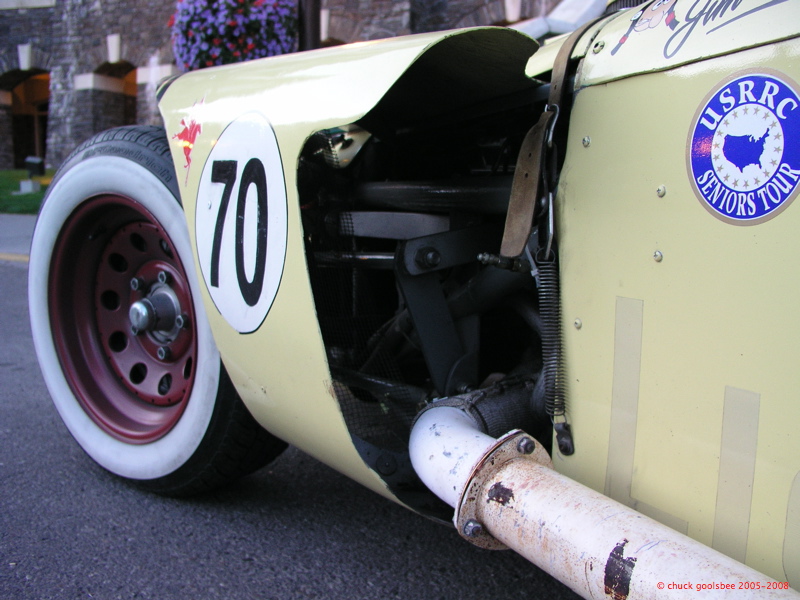
Car Photo of the day: “Special”

Back in the day “Special” didn’t mean the short bus. It meant something unique and different. This car is one of those legendary Specials from the 50s. A car which was built for pennies in a California garage and went out to beat legendary machines made for “cubic money” in places like Maranello and Stuttgart. Do you know its name?

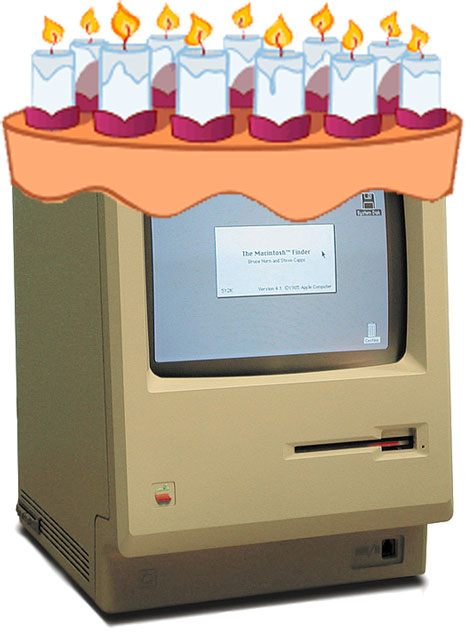
Happy Birthday Macintosh!

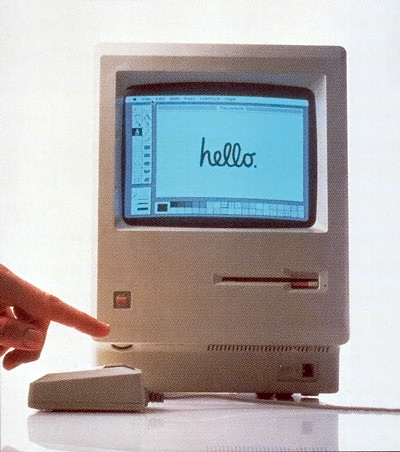
Today is the Apple Macintosh’s 25th birthday. Time flies doesn’t it? I owe a lot in life to this little machine.

I first met the Macintosh in March of 1984. I was a Junior at Texas Tech University, studying Graphic & Package Design under Frank Cheatham. My Production class went to a computer store to have a look at one and get a demonstration. I can distinctly remember being impressed with the graphic capabilities of the machine and the quantum leap in the user interface from all other computer systems I’d seen before. My good friend and previous roommate was a Computer Science major, who built systems in our dorm room, so I was very familiar with computers, though not much of a user then. My other strong memory from that day was turning to a classmate and saying:

“When this thing gets “real” fonts, it will take off.”

I was referring of course to the early bitmapped “city name” (Monaco, Chicago, Geneva, etc) fonts that shipped with the Macintosh. “Real” fonts are just that, real. Typography that has been created and refined by masters over hundreds of years. Back when I went to school we had to learn to render typefaces by hand and I could write freehand in Garamond, Baskerville, Franklin, Helvetica, Century Schoolbook, and many other traditional fonts. Being able to just bang out a perfect typeface on a screen was a dream of every designer back then.

Well, either I was perceptive, or prophetic because not long after my graduation and entrance into the professional world Aldus shipped PageMaker, Adobe shipped PostScript and broke open the world of “real” fonts … on the Macintosh. I was present at the birth of “desktop publishing” as I was a young designer working in Seattle at the time, and all the “old guys” (as I called people my age back then) were terrified of computers and expected us kids to do all the technological heavy lifting. I learned everything I could about computers, software, networks, etc. Within a few years I was managing systems instead of designing things. By 1991 I was no longer a Graphic Designer, I was an IT guy. My design education has served me well however as the entire purpose of design, at least how it was taught to me, was the communication of complex concepts in visual/verbal form. Frank Cheatham insisted that we had to be able to EXPLAIN why we made the design choices we did. They had to make sense, otherwise, as he often said, “it was just decoration.” From that education I learned how to explain complex technology to non-technical people. I have also been able to explain non-technical things to technical people. (I’m a English-Geek translator.) This has allowed me to very successfully manage a class of people that many believe are unmanageable, “IT guys”.

I did my last professional graphic design job in 1994, designing the corporate identity of the company started by a friend of mine… a network geek I met “online” several years before on a Mac-focussed BBS. He was running the network at a local college, while I was running one at a department store‘s in-house Advertising agency. The company he started? digital.forest. That’s right, the company I joined six years later. Before that though my career took me to a publishing company headquartered in London. Along the way I learned UNIX (to manage Sun Sparcservers that ran The Bon’s OPI system), learned multi-protocol networking, people management, budget management, project management, etc. At The Bon I was telling “old white guys in ties” about this new thing called the Internet. I built my first DNS & web servers in 1995. Launched a web company of my own in 1998, and sold it in 2000.

If it were not for this little machine with a 9″ screen I’d still be drawing typefaces while designing things on paper. In a lot of ways I owe my whole professional career and adult life to this little computer from Cupertino. It changed my world. Changed my profession. Changed my career. Changed my life in some very profound ways. It even introduced me to most of my friends. It has been a very interesting 25 years. Happy Birthday Macintosh. I’ll drink a toast to you tonight.

Peripatetic

Apparently a photograph of me & my father, driving in the 65E appears in the March 2009 issue of “Classic Motorsports“… I guess as part of the article titled “Jaguar E-type Buyer’s Guide.” I have yet to confirm this however.

Today at lunch I went to a local Barnes & Noble bookstore to see, and unfortunately could only find the January 2009 issue. I did note a British car magazine with a D-type on the cover so I flipped through it. As I was about to slide it back on the rack I noted a familiar image on the backside.

Sure enough, the famous “Miss January” shot of the 65E, which has graced the very first XKEdata.com calendar, as well as won the first annual SNG Barratt photo contest. I guess SNG are getting good milage from the image.

I didn’t buy the magazine, as it was $10.50(!) so I just snapped a photo with my cell phone. 😉