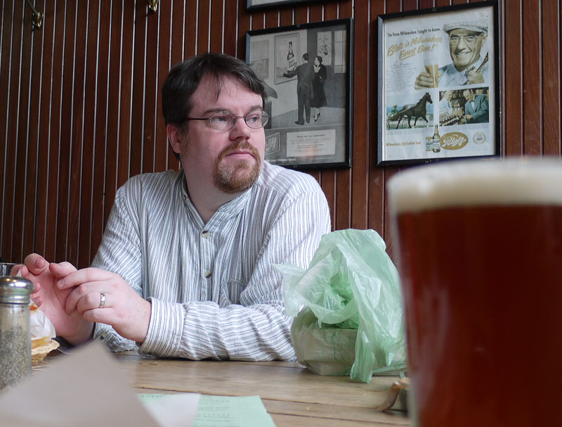
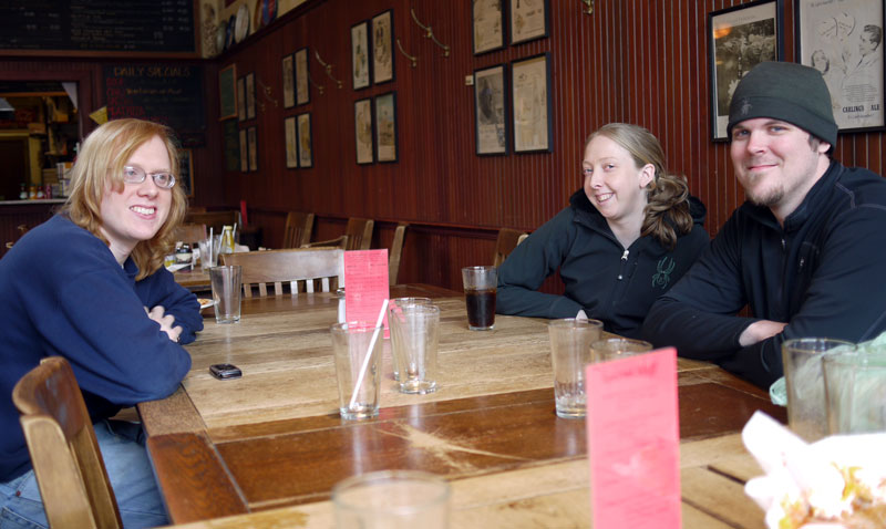
I spent yesterday in Seattle attending to several important life tasks. The foremost of which was saying “farewell” to a great friend and colleague, Bill Dickson. I’ve known Bill for around twelve years, and had the great pleasure of being his boss for a fair amount of that time. Bill’s a great guy, and one of the best sysadmins I’ve ever managed. Bill has found a new job, in another state, so is leaving Seattle in the next few days. He held court at the Big TIme Brewery in the University District yesterday from about 11:30 AM until sometime after 3 PM. I showed up about 12:30, and hung around until a bit after 3. A parade of well-wishers and old friends came by to say their farewells. Among the folks there were a few other ex-digital.forest tech staff, including the amazing Tom Kepler, and Matt Jay with his wife Jen.
Quite a few other folks I had hoped to see were absent. 🙁
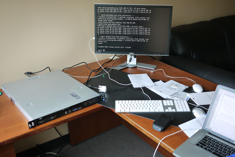
Earlier in the day I was actually at digital.forest, in my old office (now strangely and sadly empty) building a new server. It is a nice little dual-processor, 1U (but not unnaturally long!) server. Soon I’ll be moving this website, and all my other scattered web properties (www.goolsbee.org, etc.goolsbee.org, mac-mgrs.org, etc etc) onto this machine. I have stuff scattered all over both d.f shared servers, and a few of my own, very old, and very crufty servers (including a 1998-vintage 233MHz G3, which serves most of the images on this site!) The point being to consolidate and make my personal webstuff more portable. Less impact on d.f, and easy to relocate should I need to do so.
Before Bill’s send-off I spent a bit of time installing an operating system (BSD) on the hardware. In a lot of ways this new server will keep me connected with Bill, as he’s moving his web stuff onto this new server as well. I trust him with root more than I trust myself.
After 3 PM I ran back downtown, and had a meeting/interview with the CTO of a company that is interested in me. Yes, a job interview on a Sunday. More news on that should it develop.