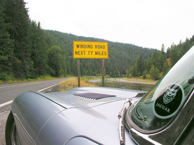
To some this sign may be a warning. To others it is an invitation. A temptation. A true desire.
I’ve driven this particular road many times and always pause at that famous sign. It is one of those landmarks and moments where you step out of the car, relax a bit, stretch your legs, gather your thoughts, take a deep breath… and then dive in. As the road coils and contorts before you the senses heighten and sharpen, and your focus becomes laser-like. Right now I’ve metaphorically pulled over at that sign and am shaking the thoughts of the long straightway that lies behind me out of my mind, preparing for the focus required of the next challenge.
After ten years in my position at digital.forest, I’m looking to move on to something new.
If digital.forest were a road it would be a well-maintained six-lane freeway today… but I knew it when it was a dirt track alongside a cow pasture. Founded by a close friend in 1994 it was essentially a one-man operation for several years. My friend brought me on-board in the spring of 2000. In the decade since it has grown and prospered. The road did indeed have many treacherous grades and diminishing radius curves, but we navigated them all with aplomb and daring. Our industry boomed, and while we managed to raise some very modest capital, we watched in awe as competitors pulled in millions of dollars, and built amazing facilities. Then, very soon thereafter our industry busted. Those very same competitors had over-built, over-extended themselves, and died off at an astonishing rate not seen on earth since the K-T Extinction Event. We used our revenues wisely, not spending on luxury offices or standard “dotcom datacenter” frivolous eye candy, but instead focused on finding, serving, and retaining what we had: Great Clients. We did this through conservative spending on what was really important to our clients, namely buying critical infrastructure to ensure their uptime. This allowed us to grow and thrive when others were shrinking or dying. Of all the things we’ve done before or since, those worst days of our industry were truly digital.forest’s finest hour, and I look back at what we did, and how we did it, with pride.
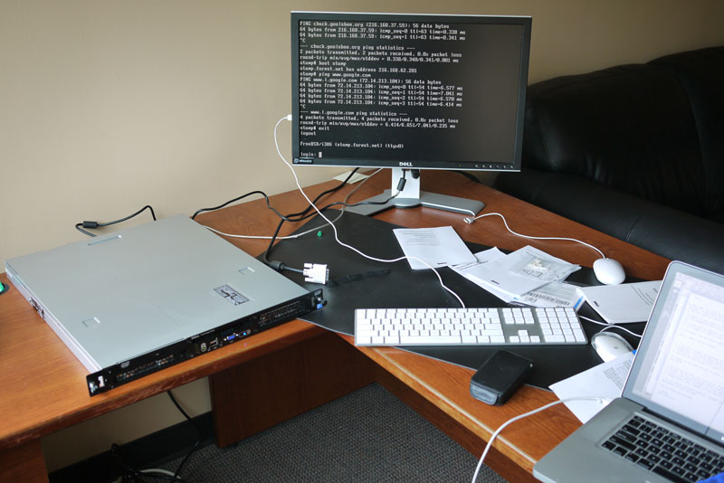
We filled our original facility to capacity, and in 2004 went looking for a new one. We found one of those amazing facilities built in the exuberant boom days that had never been completed. It was perfect for us. Not too big, but with room to grow. Over several months in 2004/2005 we completed the long-dormant construction and moved in. It was the craziest half-year of my professional life. My team worked around the clock, seven days a week, for four months straight to build, equip, and then move a live datacenter twenty-nine miles across a major metropolitan area. Operationally it was a flawless migration. Our Account Management team did an amazing job working with our clients, letting them know what was going on and why, and scheduling their move times weeks in advance, often down to the minute. My Technical Operations team executed the move with speed and precision. Most importantly, we did not lose a single client in the process.
What amazing clients they are! I’ve met truly wonderful people during my time at digital.forest. It has been a privilege to serve them, and a joy to watch many of them succeed and grow. Most of all though, the greatest benefit for me has been to make many of them my friends. Our clients are in very good hands, as my other privilege has been to work with some of the most competent and capable people I’ve ever known in my twenty-five years in business.
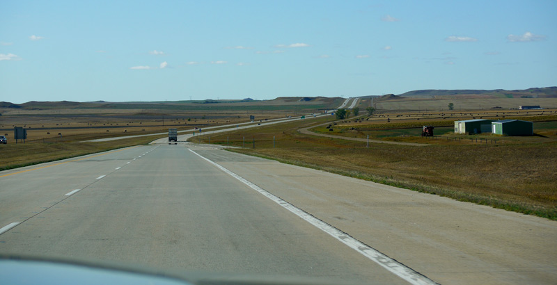
That move to a new facility is what transformed digital.forest from a rural two-lane blacktop into a super-highway. We expected that “room to grow” would last us a few years, but within months we were expanding again, metaphorically going from two lanes to four, and then six. Curves were smoothed out, bridges built, grades reduced, and guardrails erected. What was once a winding road was now a superslab, on a straight and fast course over the horizon.

Personally, I prefer the winding road to the wide freeway. The challenges are more vivid, and the work keeps me alert and feeling alive. It has nothing to do with the size of the company, as even large organizations can have immediate challenges. I joined one of the larger companies in the Fortune 500, Federated Department Stores (now Macy’s Inc.) in 1990 when they committed to completely transforming their advertising processes from analog to digital. What an amazing ride that was! I left Macy’s to join a small, but international publishing company in 1995 to create an entire IT operation from scratch, then volunteered to transfer to their UK headquarters to successfully reorganize their IT department. From there I went to digital.forest and helped it grow eightfold during my tenure. It is on these sorts of courses I prefer to grab the wheel and shifter to carve up the corners. No freeway driving for me.
I have some projects to complete and/or hand off to others at digital.forest, but mostly I’ll be focussed on finding that next great road. Something that will get my engine roaring in tune with gear changes and sweeping curves.
Let me know if you hear of one.
